Scope note: this guide uses public product and pricing pages. It does not claim private account testing or export benchmarks.
Start with repeated slides
Most presentation systems look good on a title slide. The stronger test is a plain agenda, a dense comparison, a metrics table, a customer quote, and a pricing slide. These are the slides teams touch every week. If they break alignment, lose contrast, or require a designer to fix every edit, the system is decorative rather than operational.
The best deck system makes the boring slides safe. It gives users enough flexibility to communicate clearly without letting every page become a new layout invention.
Tool fit
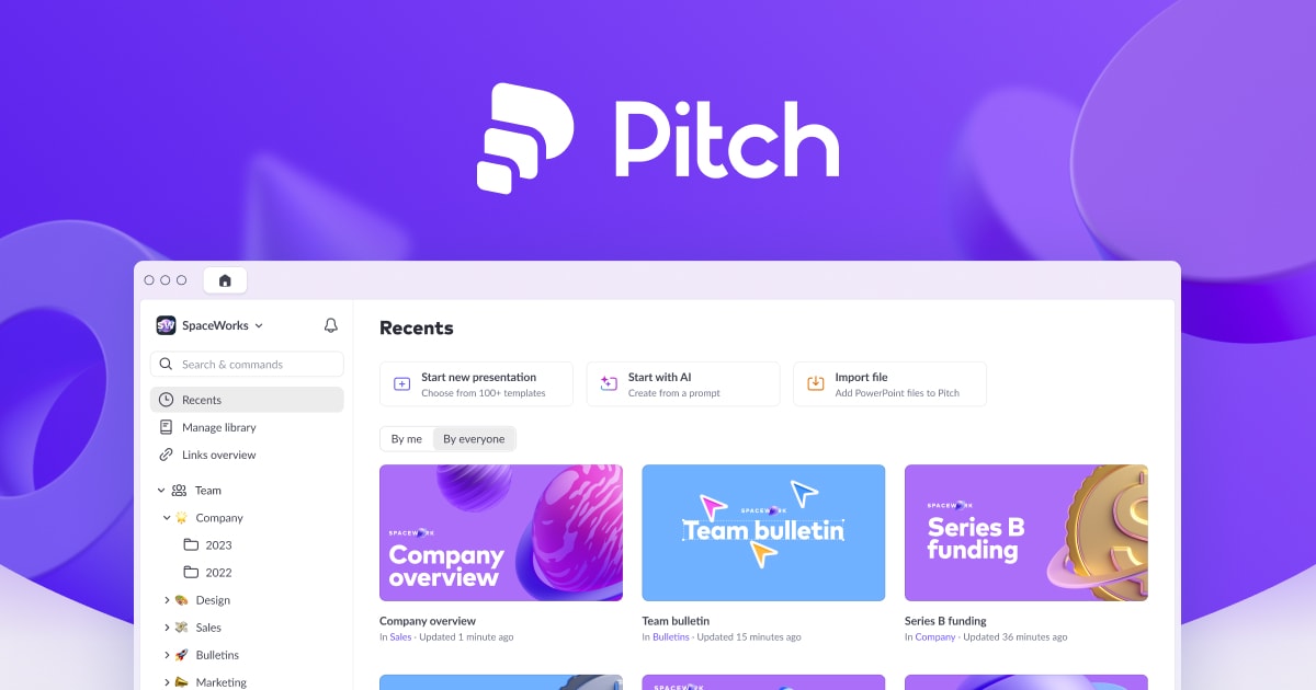
Pitch is strongest when the team wants a collaborative presentation workspace with brand control, shared decks, and modern presentation tooling. Beautiful.ai is strongest when the team values smart slide layouts and brand guardrails that make acceptable design easier for non-designers. Slidesgo is strongest as a template library when the team needs editable starting points and can handle quality control internally.
No tool removes the need for editorial discipline. A template library still needs rules. An AI slide builder still needs a clear story. A collaborative workspace still needs owners for brand and content.
Evaluation table
| Need | Better signal | Risk to check |
|---|---|---|
| Sales proposal system | Shared slide library and approved modules | Old slides copied outside the source |
| Investor update deck | Data slides and export reliability | Charts rebuilt manually each month |
| Brand campaign deck | Theme, image rules, and type scale | Decorative layouts that do not fit real copy |
| Team-wide templates | Permissions and guardrails | Everyone can edit the master system |
Export discipline
Before adopting a system, export a PDF and share an editable version with someone who did not build it. If fonts shift, images crop badly, charts flatten, or comments become confusing, the system is not ready. Also check whether premium fonts, stock images, icons, or mockups inside the deck carry separate rights.
Strong presentation systems document dependencies. They explain which fonts are used, which images are licensed, what can be replaced, and which slides are approved as source modules.
Maintenance model
Every presentation system needs an owner. That owner updates screenshots, retires outdated claims, reviews case-study slides, and decides which new modules deserve to enter the library. Without ownership, even a beautiful system turns into a cluttered slide graveyard.
Verdict
Choose the system that survives ordinary editing. A cover slide can impress; a stable comparison slide earns its keep. For lean teams, the winning presentation system is the one that keeps sales, fundraising, and internal updates moving without creating a hidden design-support queue.
Internal next steps: review Figma vs Canva, the template marketplace shortlist, and the design subscription deal guide before purchasing a deck library.
Adoption plan
Start with a small approved library rather than a huge template dump. Build or buy the ten slide types the team actually repeats: cover, agenda, section divider, problem, product screenshot, metrics, comparison, customer proof, pricing, and next steps. Then write rules for when a slide can be duplicated, edited, or retired. A presentation system becomes usable when people know which module to start from.
Assign one owner to the library. That owner does not need to design every deck, but they should control master slides, brand themes, screenshot freshness, and retired modules. Without ownership, each team slowly edits its own copy and the system becomes a set of similar-looking but incompatible decks.
Export and collaboration tests
Before release, test the system in the environment where it will actually be used. If the sales team exports PDFs, inspect PDF output. If executives present from a browser, test that. If external partners edit a copy, make sure fonts, charts, and images survive the handoff. A deck system that only works on the designer's machine is not a system.
Content quality rule
Templates cannot rescue unclear thinking. Every module should support a known story move: explain the problem, prove traction, compare options, show the workflow, or close the decision. If a slide exists only because it looks attractive, remove it from the approved library.
Scoring rubric
Score each system on five dimensions: content density, editability, export quality, brand control, and library maintenance. Content density checks whether real copy fits. Editability checks whether non-designers can make normal changes. Export quality checks PDFs, shared links, and copied files. Brand control checks colors, fonts, image rules, and master slides. Library maintenance checks whether the system has an owner and a retirement process.
A system does not need to score perfectly. It needs to score well in the dimension that matches the job. A fundraising deck may prioritize narrative control and export polish. A sales deck may prioritize modular reuse and team access. An internal update deck may prioritize speed and consistency.
Questions for vendors and template sellers
Ask whether fonts, icons, and stock images are included or separately licensed. Ask how templates behave when exported to PDF. Ask whether slides rely on hidden master objects that normal users cannot understand. Ask what happens if a team member duplicates a file outside the workspace. These questions reveal whether the template is production-ready or only visually attractive.
When to commission custom deck work
Commission custom work when the deck is a strategic asset: fundraising, enterprise sales, analyst briefings, or a major launch. Buy templates when the workflow is recurring and the story is already known. The more a deck determines business outcomes, the more the team should invest in a tailored system rather than a broad library.
Final decision test
Give the system to the person most likely to use it under pressure. Ask them to build a real five-slide update, export it, and hand it to another person. If the result remains clear, on-brand, and easy to revise, the system is ready. If it fails, fix the slide library before buying more templates or adding more decorative layouts.
Presentation systems checked for this guide
A presentation system should protect structure, export quality, and brand consistency after five different people edit the deck. The entries below are the explicit image-backed options used in the article. Each referenced option has a local image, a public source URL, and a practical reason to include or skip it.
| Option | Best use | Main caution |
|---|---|---|
| Pitch | best for collaborative workspace decks, team review, and repeatable sales or investor narratives | the library still needs an owner who retires outdated slides |
| Beautiful.ai | best for guided layouts, brand guardrails, and teams that want slide structure to resist manual drift | less ideal when designers need full art-direction control on every slide |
| Canva | best for mixed marketing teams producing simple decks, social derivatives, and campaign collateral together | requires locked templates and review rules to prevent off-brand exports |
| Adobe Express | best for quick pitch-deck starts and Adobe-adjacent campaign workflows | should sit downstream from the actual identity and message hierarchy |
| Slidesgo | best for quick presentation starting points and education-style template needs | templates need enough editing to stop the final deck from looking generic |
Pitch
Pitch is included because best for collaborative workspace decks, team review, and repeatable sales or investor narratives. The image above is stored locally and tied to the public source page used for this review: https://pitch.com/pricing/us.
The main caution is that the library still needs an owner who retires outdated slides. For content-ops review, this means the article should treat Pitch as a specific evaluated option, not as a throwaway example. If the product or agency appears in a shortlist, comparison, or buying recommendation, the page needs a visible asset record and a source trail.
Beautiful.ai
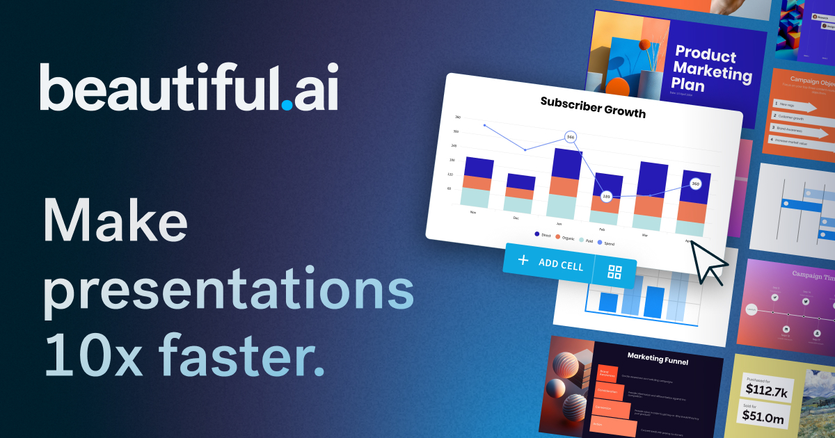
Beautiful.ai is included because best for guided layouts, brand guardrails, and teams that want slide structure to resist manual drift. The image above is stored locally and tied to the public source page used for this review: https://www.beautiful.ai/teams.
The main caution is that less ideal when designers need full art-direction control on every slide. For content-ops review, this means the article should treat Beautiful.ai as a specific evaluated option, not as a throwaway example. If the product or agency appears in a shortlist, comparison, or buying recommendation, the page needs a visible asset record and a source trail.
Canva
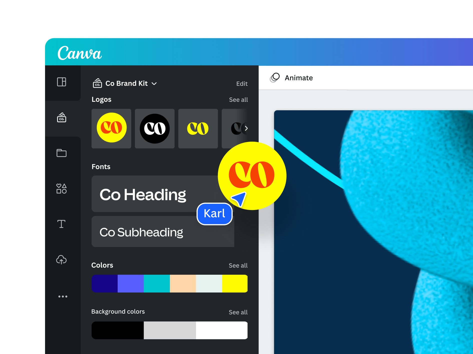
Canva is included because best for mixed marketing teams producing simple decks, social derivatives, and campaign collateral together. The image above is stored locally and tied to the public source page used for this review: https://www.canva.com/pro/brand-kit/.
The main caution is that requires locked templates and review rules to prevent off-brand exports. For content-ops review, this means the article should treat Canva as a specific evaluated option, not as a throwaway example. If the product or agency appears in a shortlist, comparison, or buying recommendation, the page needs a visible asset record and a source trail.
Adobe Express
Adobe Express is included because best for quick pitch-deck starts and Adobe-adjacent campaign workflows. The image above is stored locally and tied to the public source page used for this review: https://www.adobe.com/express/templates/presentation/pitch-deck.
The main caution is that should sit downstream from the actual identity and message hierarchy. For content-ops review, this means the article should treat Adobe Express as a specific evaluated option, not as a throwaway example. If the product or agency appears in a shortlist, comparison, or buying recommendation, the page needs a visible asset record and a source trail.
Slidesgo

Slidesgo is included because best for quick presentation starting points and education-style template needs. The image above is stored locally and tied to the public source page used for this review: https://slidesgo.com/pricing.
The main caution is that templates need enough editing to stop the final deck from looking generic. For content-ops review, this means the article should treat Slidesgo as a specific evaluated option, not as a throwaway example. If the product or agency appears in a shortlist, comparison, or buying recommendation, the page needs a visible asset record and a source trail.
Editorial scoring model
This review uses five checks: slide library discipline, brand locks, export reliability, collaboration model, update cadence. The criteria are intentionally operational. A visually strong resource can still be a poor recommendation if the license is unclear, the file structure is hard to maintain, or the team cannot repeat the workflow without a designer repairing every output.
For a company trying to make sales, board, product, and recruiting decks share one repeatable system, the best choice is the one that reduces review cycles while preserving brand control. That means the article weighs source evidence, product or portfolio clarity, handoff quality, and recurring workflow fit. It does not assume that a bigger library, a famous studio, or a lower monthly price is automatically better.
Price and plan details should be checked on the linked official pages before purchase because SaaS packaging and marketplace licenses change. The recommendation here is based on public product positioning, visible documentation, and editorial fit at the time of review, not private testing or negotiated enterprise terms.
Operational notes
The best presentation system is boring in the right places. Title slides, agenda slides, section dividers, case-study pages, pricing slides, comparison tables, and closing slides should have obvious rules. Creative freedom belongs in the message, not in rebuilding margins every week.
Buyer discipline
Export quality should be tested before rollout. Create a sample deck with long titles, charts, screenshots, speaker notes, and a few dense comparison slides. Export to PDF and the formats the sales or investor team actually sends. If charts shift, fonts change, or screenshots blur, fix the system before more people adopt it.
Field test
Slide libraries decay unless someone removes old work. Assign an owner to archive outdated claims, stale product screens, expired logos, and campaign-specific slides. That maintenance work is what separates a system from a folder of nice examples.
Procurement and rollout workflow
Start with a written use case. Name the output, owner, deadline, approval path, and channels where the asset or service will appear. That single paragraph prevents vague buying: the team is no longer asking whether a tool is good in general, it is asking whether the tool solves a real production job.
Next, save the evidence. Keep the source URL, downloaded image or screenshot, license page, pricing page, and a note about why the option was considered. For design resources, this record is as important as the final recommendation because rights and file provenance often become questions months later.
Then run a small production test. Build one real asset, deck, campaign frame, or handoff package. Ask the reviewer to score output quality, editing friction, brand consistency, and compliance confidence. If the answer depends on heroic manual cleanup, the option is not ready for broad adoption.
Finally, set a review date. Subscriptions need renewal checks; agency relationships need phase gates; fonts and templates need usage audits; and design tools need owner reviews when the brand system changes.
Risk register
The first risk is overbuying. A large catalog, famous studio, or polished template can make the team feel safer while creating more assets to govern. The fix is a narrow acceptance test: identify the exact job the option must perform and reject anything that cannot show value there.
The second risk is license drift. Files move from experiments into production, contractors reuse assets, and teams forget which plan or license covered the original download. Keep a license archive beside the working files, not in a separate inbox. Include the receipt, source URL, image file, and a short allowed-use note.
The third risk is brand drift. Tools that help non-designers move faster also help them create off-system work faster. Templates, brand kits, and agency handoffs need named owners. Without ownership, the approved system decays into duplicated files and local exceptions.
The fourth risk is stale evidence. Public product pages and pricing pages change. Revisit the linked sources before a renewal, a new client use, or a major campaign launch.
Final recommendation
Choose the tool that keeps the next editor from damaging the deck. Layout automation and brand locks matter more than one beautiful sample slide.
The practical decision rule is simple: choose the option that makes the next production cycle clearer. If the team can explain the use case, confirm the rights, produce the asset, and hand it off without hidden cleanup, the choice is defensible. If the choice only looks attractive because the preview is polished or the deal is urgent, keep it out of the standard workflow.
Internal next steps: compare Figma vs Canva, template marketplaces, font licensing checklist, mockup and asset libraries, and design subscription deal checks when the decision touches more than one part of the creative stack.